

EDI Dashboard Technical Guide
(Updated: September 2024)
The EDI Dashboard Technical Guide is intended to support the interpretation and use of data on the EDI Data Dashboard.
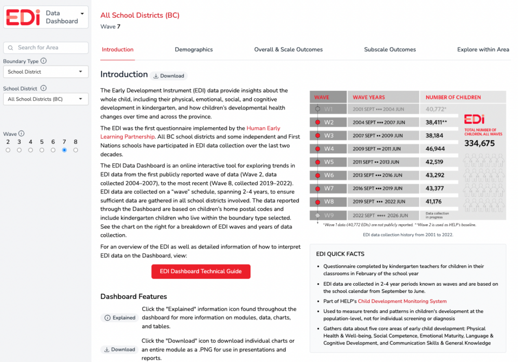
The EDI Data Dashboard is an online, interactive tool for exploring patterns and trends in EDI data from the first publicly reported wave of data (Wave 2, data collected 2004–2007), to the most recent (Wave 8, collected 2019–2022). The data reported through the Dashboard are based on children’s home postal codes and include kindergarten children who live within the boundary-type selected by the viewer.
The EDI Technical Guide provides explanations of each module and all chart views available on the dashboard. The Technical Guide also highlights dashboard features and offers helpful tips for navigating the dashboard. Scroll down to Using the Dashboard or choose from the following links to dive right into more information a Dashboard module:
The next section is a brief overview of the EDI and EDI data.
Introduction to the EDI and EDI Data
EDI in Brief
The EDI is a questionnaire completed by kindergarten teachers for the students in their classrooms in February each school year. It was developed by Dr. Dan Offord and Dr. Magdalena Janus at the Offord Centre for Child Studies at McMaster University in Hamilton, Ontario.
HELP has been collecting EDI data province-wide in BC since 2001 — all public school districts as well as some independent and First Nations schools have participated in the data collection over time. These data are collected in partnership with the education system, which covers the province over a two to four-year period called a “wave.”
RELATED: Learn more about the EDI (Overview)
RELATED: Watch the “What is the EDI?” introductory video
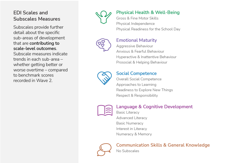
EDI Scales & Subscales
The EDI measures children’s ability to meet age-appropriate developmental expectations across five core areas, or “EDI scales”. Each EDI scale is made up of a set of subscales that measure specific areas of development within the scale. The chart below shows the relationship between EDI scales and subscales.
EDI Outcome Measures
In past EDI data reporting, the focus has been on highlighting rates of developmental vulnerability in populations of children. However, the EDI measures the whole distribution of children’s outcomes — vulnerable, at risk/in flux, or on track — allowing us to understand areas of strength and potential across the five key areas of development and overall.
About EDI data
EDI data are collected on a “wave” schedule, spanning 2-4 years, to ensure sufficient data are gathered in all school districts involved. The data reported through the Dashboard are based on children’s home postal codes and include kindergarten children who live within the boundary type selected. See the chart below for a breakdown of EDI waves and years of data collection.
Suppression and margin of error
The EDI is a population-based measure. When coverage of the population is low or the population size of an area is very small, data may be suppressed. More specifically, data are suppressed when there are fewer than 35 children in a neighbourhood or other administrative boundary (e.g., Health Authority Health Service Delivery Area or HSDA), for confidentiality reasons. The data are also suppressed when the uncertainty of the results (i.e., the margin of error) is greater than 10%, which can result from low coverage, particularly in areas with small populations.
Margin of error is the degree of uncertainty about the exact value of what is being measured, when results are based on samples rather than the whole population. The margin of error for any particular result is a function of both the size of the sample and the size of the population (i.e., the participation rate). Larger populations require a smaller participation rate than smaller populations, to have the same margin of error. At HELP, results are reported when the margin of error is +/-10% or less; otherwise, results are suppressed due to too much uncertainty.
Meaningful change
The EDI Data Dashboard explores patterns and trends in EDI data, including trends over a long period of time. Collecting EDI data over multiple waves allows us to explore trends in children’s development — while some areas see improvements over time for particular aspects of children’s developmental health, others see declines. When looking at these changes over time, it is important to identify the amount of change that is meaningful, or change that is large enough to be worthy of further exploration and discussion.
HELP’s definition of meaningful change is based on Critical Difference, which is a statistical method for determining when two scores (e.g., an area’s EDI vulnerability rate over two time periods) are different enough to be “worth talking about.” This means that we are reasonably confident that the difference is real, rather than the result of uncertainty due to measurement issues.
Each EDI scale and subscale has its own level of uncertainty, some larger than others. In addition, for all scales and subscales, the amount of difference that is meaningful depends on the number of children represented, and the degree of change in the scale or subscale. As the number of children in a population gets smaller, the Critical Difference score required to be meaningful becomes larger.
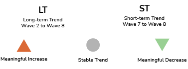
We consider both statistical significance and practical significance when interpreting meaningful change, and limit our reporting of meaningful change to long-term and short-term trends, using the following symbols:
At this time, the EDI Data Dashboard reports on meaningful change for vulnerability rates (not the full distribution of outcomes) at the overall and scale level.
NOTE: Trends are not available (N/A) if there are no data (i.e., the district did not participate) or data are suppressed (i.e., there are fewer than 35 kindergarten children in one or both waves or the margin of error threshold is reached).
Getting Started on the Dashboard
Guided Tour
When accessing the EDI Data Dashboard for the first time, a guided tour pops up that highlights key features of the dashboard. Check the “Don’t show this again” box if you do not want the tour to appear every time you visit the Dashboard. To access the guided tour again, click the “Replay Tour” link located in the Dashboard footer.
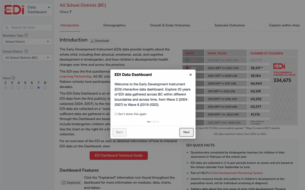
Throughout the Dashboard, you will find the “Explained” and “Download” icons beside section titles and beside individual maps and charts within a module.
 – Click the “Explained” information icon found throughout the dashboard for more information on modules, data, charts, and tables.
 – Click the “Download” icon to download individual charts or an entire module as a .PNG for use in presentations and reports.
NOTE: Currently, the dashboard does not have a built-in print or PDF feature. Use your browser’s print function to print a view of the current state of the dashboard. Some browsers also have options to print to a PDF.
TIP: If there is an issue with fitting the full width of dashboard on a page, try reducing the scale of the print view.
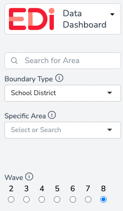
Navigation
On the left-hand side of the dashboard is the navigation panel. This is where the search area is set, the wave selection is made, and also where you can switch from the EDI Dashboard to the MDI Dashboard.
Project Switcher
Clicking on the EDI logo brings up a drop-down menu that allows you to switch to the MDI Data Dashboard. See the EDI Quicklinks below for more information on the MDI.
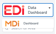
MDI QUICKLINKS:
MDI Data Dashboard
MDI Data Dashboard Technical Guide
More information about the MDI
Search Bar and Boundary Type
If you know the specific school district or neighbourhood you would like to explore, use the “Search for Area” search bar to type the name of the district or neighbourhood of interest.
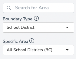
Alternatively, you may use the next two drop-downs to first select a Boundary Type then the next drop-down will allow you to select an area within that boundary type. The EDI Dashboard allows users to explore EDI data through several boundary types from BC Ministries of Education and Child Care, Health, and Children & Family Development, as well as HELP-designated neighbourhoods. Below is a list of all boundary types and how they nest within each other.
Education Boundary Type – Uses geographic boundaries created by the Ministry of Education and Child Care (MECC). The HELP Neighourhood* boundary type may be found within the Education Boundary Type.
- School Districts
- HELP Neighbourhoods*
VISIT: School District Boundaries
Health Boundary Type – Uses geographic boundaries created by the Ministry of Health (MoH)
- Health Authorities
- Health Service Delivery Areas
- Local Health Areas
- Community Health Service Areas**
- Local Health Areas
- Health Service Delivery Areas
VISIT: Health Boundaries
Children and Family Boundary Type – Uses geographic boundaries created by the Ministry of Children and Family Development (MCFD)
- Ministry of Child and Family Development Regions
- MCFD Service Delivery Areas
- MCFD Local Service Areas
- MCFD Service Delivery Areas
VISIT: MCFD Boundaries
By default, the Dashboard is set to the “School District” Boundary Type with “All School Districts (BC)” as the Specific Area. The data for “All School Districts (BC)” includes all children that had an EDI started for them for the selected wave of data collection.
Once a Boundary Type and Specific Area are selected, the Dashboard will display data for that selection. Depending on the area, comparative data for the top-level aggregation will also be displayed. For example, when viewing Neighbourhood data, the data from the related School District are shown and when viewing School District data, the data from All School Districts (BC) for the selected wave will be shown. When viewing boundaries within the Health and MCFD Region boundary types, the comparison will be to the top-level aggregation. For example, when viewing a specific Local Health Authority (LHA), the comparison data will be to the Health Authority that the LHA falls within. Likewise, if you are viewing a specific MCFD Service Delivery Area (SDA), the comparison data will be to the MCFD Region that the MCFD SDA falls within.
NOTES:
*HELP Neighbourhood boundaries were created by HELP through meaningful aggregations of census dissemination blocks, postal code boundaries, city planning boundaries, and geographic features. The neighbourhood boundaries were vetted through a community review process and were adjusted when necessary to remain useful for communities. The neighbourhood boundaries were constructed to nest within school district boundaries.
The data available through the EDI Data Dashboard are reported based on children’s home postal codes and include kindergarten children who live within the boundary type selected. Once a boundary type is selected, EDI data are shown for the location selected along with comparative data from the top-level aggregation (for example, when viewing Neighbourhood data, data from the related School District is provided OR for Local Health Areas, data from the related Health Authority is provided).
**Community Health Services Area (CHSA) boundaries were created by the Ministry of Health in 2019 as a community-level geography that nests within the Local Health Areas (LHA). EDI data for CHSA boundaries are only available from Wave 7 onwards.
TIP: Boundary types can also be explored using the maps in the Overall Outcomes and Scale Outcomes modules. You may zoom in and out of the map and by clicking on a desired location, the dashboard will update to show that location’s data.
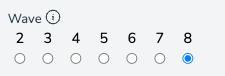
Wave Selector
EDI data are collected in BC school districts and participating independent and First Nations schools. These data are collected in partnership with the education system over a two- to four-year period called a “wave.” Large school districts participate in just one of the years in a wave, usually in the first or second year. Smaller school districts will participate in multiple years of a wave, in order to ensure that the total number of children per neighbourhood in a wave is sufficiently high to allow for a reasonable determination of change over time.
By selecting a wave on the navigation panel, the data in the dashboard will update to reflect the wave selected (e.g., Wave 6) along with trends over time across all available waves.
NOTE: Where wave data are not available due to non-participation, suppression, or uncertainty of results for an area, the corresponding wave will not be available to select. When switching between areas and wave data are not available for an area, the most recent wave for which data are available will be displayed.
Using the Dashboard
To the right of the navigation panel is the main information panel where charts and data are viewed and where modules may be selected. This main panel has key features that include:
Breadcrumb
A breadcrumb or “breadcrumb trail” is another navigation feature that shows your geographical location within the hierarchy of boundary types and areas. For example in this breadcrumb, the data shown are for Fort St. James North, a Community Health Service Area:

NOTE: In this example, the numbers beside each boundary name corresponds to a nested numbering scheme for Health Authority regions.
Using the breadcrumb, you can quickly shift to a parent boundary type by simply clicking on the name of the boundary within the breadcrumb. For example, clicking “Northern – 5” will refresh the Dashboard and show data for the Northern Health Authority boundary type:

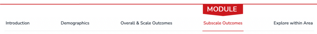
Module Navigation
The EDI Data Dashboard has five modules to choose from. Each module is accessed through this top-level navigation:

Further information and tips for navigating each of the Dashboard modules are outlined in the next section. Scroll through each section or use the links below to jump directly to a section of interest:
Exploring EDI Data
Begin exploring data by choosing a module. This section explains each module in detail including all available chart views in the module.
Module: Introduction
The Introduction module serves as a landing page when first accessing the EDI Data Dashboard. The Introduction provides a brief overview of the EDI including some quick facts about the EDI. An overview of the Dashboard and some key features are highlighted.
Helpful resources for using the EDI Data Dashboard may also be found in this module including:
- EDI Wave 8 Provincial Synthesis – A summary report highlighting key findings from Wave 8 of the EDI, which marked 20 years of EDI data collection in BC. View the EDI Provincial Synthesis
- EDI Overview – Learn more about the Early Development Instrument (EDI) including information on data collection and key EDI contacts. Learn more about the EDI
- EDI PowerPoint Template – A slide deck that provides an overview of the EDI, summary of BC EDI Wave 8 data, and customizable slides to showcase EDI data for your area. Download EDI PowerPoint template
- Data Library – Download a .csv of EDI data as well as HELP Neighbourhood shape files and Census data tabulated to HELP Neighbourhood boundaries. Access data library
- EDI Report Archives – View EDI Wave 7 reports. View reports
Module: Demographics
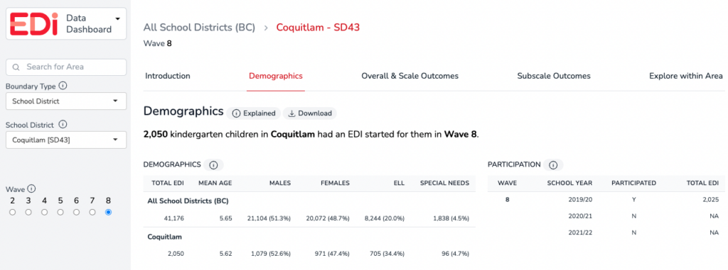
Demographic information provides contextual information for the EDI data in the Dashboard. The data available on the EDI Data Dashboard are reported based on children’s home postal codes and include kindergarten children who live within the boundary type selected.

The demographics headline contains the total sample for the specific area and wave selected. In this example, a total sample of 41,176 kindergarten children in BC had an EDI started for them by in Wave 8.
Demographics Table
Demographic data on the EDI include kindergarten children who live in the selected area and who had an EDI started for them by their classroom teacher.
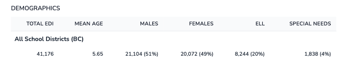
- Total EDI – The total number of children in the school district for whom an EDI questionnaire has been started. In a few school districts for a small number of children, only demographic data are available. — this is most often due to a child transferring schools during the school year. The corresponding demographic data are included in the demographic counts, but they are not included in the vulnerability data in the report.
- English Language Learners (ELL) – Designated English Language Learners based on school district administrative data.
- Special Needs – Designated Special Needs based on school district administrative data.
Participation Table
Participation data are only available when the “School District” boundary type is selected. All other boundary types (Health, MCFD and neighbourhood) do not have participation data.
The participation table shows the number of total EDIs collected within a school district across the wave. The schedule for school district participation in a particular wave is based on the size of the school district and in consultation between HELP and administrators from each school district. (See more information on waves.) First Nations, or independent schools may collect EDI data in a different year of a wave cycle from the school district in the area they are located.
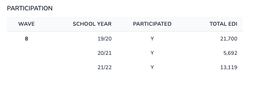
NOTE: In some cases, the participation table indicates that a school district did not participate in EDI data collection in a particular year (“N” under “participated” column) yet there is a number in the “Total EDI” column. EDI data are aggregated by where children live using their home postal code. In some cases, a child may live within a school district boundary but not attend a public school in that district, but rather a Francophone, Indigenous or independent school in the area, or they may attend a public school in a neighbouring district. As a result, children may appear in the participation counts in years when the school district did not participate. If you have questions about your school district’s participation, please contact us at edi@help.ubc.ca.
Module: Overall & Scale Outcomes
This module highlights the overall and scale outcomes data for the boundary type selected.
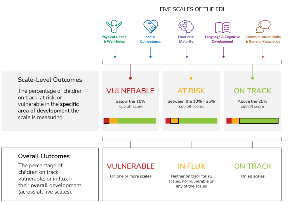
When first arriving at this module, Overall Vulnerable (red “Overall” button) is the default view. Overall outcomes are the percentage of children vulnerable, in flux, or on track in their overall development across all five scales of the EDI.
While EDI overall outcomes provide a summary of the developmental health of kindergarten children, more specific information about each of the five areas of development can be found at the scale and subscale level. The five scales of the EDI are: Social Competence (blue “Social” button), Emotional Maturity (purple “Emotional” button), Physical Health and Well-being (green “Physical” button), Language and Cognitive Development (pink “Language” button), and Communication Skills & General Knowledge (orange “Communication” button). The scale-level outcomes are the percentage of children vulnerable, at risk, or on track on the specific area of development the scale is measuring.
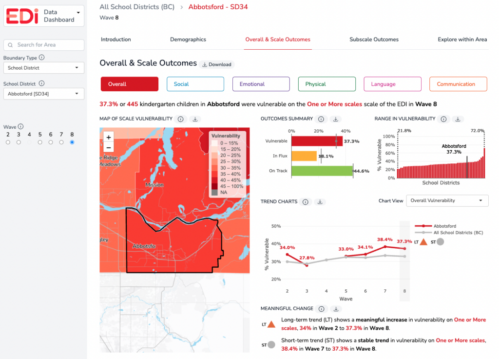
First, here’s a look at the map and charts in this module when Overall is selected.
KEY CONCEPTS IN THIS MODULE – Overall View
- Overall Vulnerable – a summary measure that reports the percentage and number of children who are developmentally vulnerable on one or more of the five scales of the EDI. Children included in this measure may be vulnerable on up to five scales of the EDI. Without additional support and care, children who are vulnerable on one or more scales of the EDI are more likely to experience future challenges in their school years and beyond.
- Overall In Flux – a summary measure that reports the percentage and number of children who are neither on track overall nor vulnerable overall. Children included in this measure may or may not catch up to their on-track peers and may benefit from additional supports.
- Overall On Track – a summary measure that reports the percentage and number of children who are developmentally on track across all five scales of the EDI. Children included in this measure are most likely to have successful trajectories in school and beyond.
RELATED: See definitions for vulnerable, at risk, and on track on an EDI Scale
MAPS & CHARTS IN THIS MODULE – Overall View
Map of Vulnerability – Overall view — All maps on the EDI Data Dashboard display rates of vulnerability. In this module, the map is indicating rates of overall vulnerability for the boundary type selected. The darker the colour on the map, the higher the overall vulnerability rate. The zoom feature is available on the map to expand or narrow down a view. Hover over an area of interest to see the overall vulnerability rate for that area or click the location to change the specific area of focus for the dashboard to the clicked area.
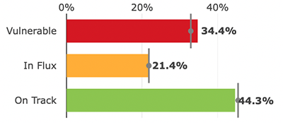
Outcomes summary bar chart – Overall view – This chart shows the percentage of children vulnerable (red), in flux (yellow), or on track (green) in their overall development for the boundary type selected. The vertical comparison line in these bar charts represents the average for all areas within the selected boundary type. For example, when viewing overall outcomes for a specific school district, the average line represents All School Districts (BC Average) within the selected wave.
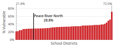
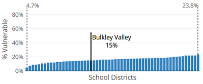
Range in vulnerability chart – Overall view – There is a wide range of overall vulnerability rates across all boundary types and areas. The range in vulnerability (overall) chart shows the distribution from lowest overall vulnerability to highest overall vulnerability within a selected boundary type. Each bar represents the overall vulnerability rate for similar boundary types (e.g., All school districts). The black bar, which appears when a specific area is selected, indicates the overall vulnerability rate for that selected area.
This chart provides helpful context for how the boundary type selected compares to other similar boundaries in terms of overall vulnerability rates. For example, if viewing neighbourhood data, is the neighbourhood on the lower or higher end of the range, or in the middle? It can be helpful to view data across waves to note if the neighbourhood’s position has changed over time or if it has remained in a similar position relative to other neighbourhoods.
Trend Charts – Overall view – Collecting EDI data over multiple years allows for an improved understanding of trends in children’s development. Explore more about EDI overall outcome trends over time with the following “Chart Views”:
- Overall Vulnerability chart view – shows the overall vulnerability rates for the selected area from Wave 2* to the current wave (red line). A comparison line is shown in grey for the related ‘parent’ boundary/region. For example, when viewing a specific school district’s data, the grey line represents All School Districts (BC) – the province overall. See the sample chart below.
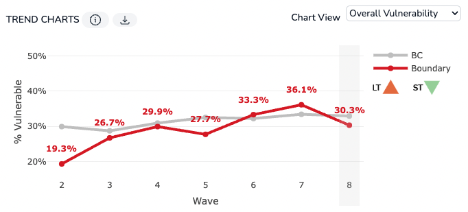
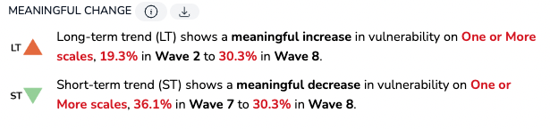
The symbols to the right of the chart indicate an area’s meaningful change in the long-term (LT) and short-term (ST). A summary of the long-term and short-term trends for the selected area are explained in the Meaningful Change section just below the trend charts:
RELATED: See more information on meaningful change.
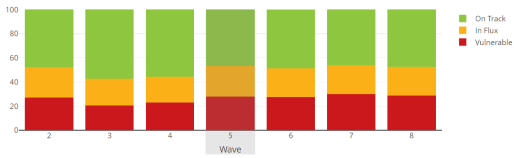
- Overall Outcomes chart view – shows the percentage of children vulnerable, in flux and on track in their overall development (across all five scales of the EDI) for the selected boundary type from Wave 2* to the current wave. See the sample chart below. Hover over each colour on the bar graph to see the percentage of children in each overall outcome category.
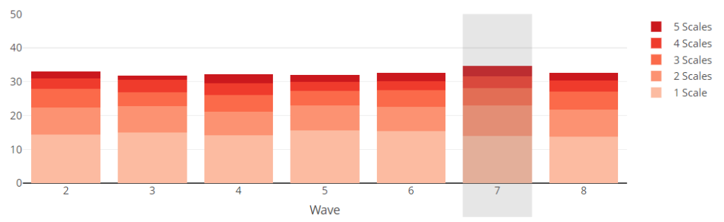
- Multiple Vulnerabilities Chart (only available when Overall is selected) – shows the percentage of children who are vulnerable on one, two, three, four, or all five scales of the EDI for the selected area from Wave 2* to current wave. See sample chart below. Hover over the layers of bars to see the percentage of children vulnerable in each category – vulnerable on one, two, three, four or all five scales.
TIPS:
When viewing two or more trend lines in a chart, toggle individual line charts off and on by clicking the corresponding line in the legend located to the right of the chart.
The legend to the right of the Overall Outcomes chart and the Multiple Vulnerabilities chart can be used to toggle each outcome or number of scales bars off and on.
NOTE: Trends are not available (N/A) if there are no data (i.e., the district did not participate) or data are suppressed. See more information on suppression.
*Due to changes in the EDI questionnaire after Wave 1 data collection, Wave 2 is HELP’s baseline and Wave 1 data are not publicly reported.
Next, here’s a look at the map and charts in this module when a Scale is selected.
The Scale Outcomes Module highlights the scale-level outcome data for the scale and boundary selected. While EDI overall outcomes provide a summary of the developmental health of kindergarten children, more specific information about each of the five areas of development can be found at the scale and subscale level.
In this module, viewers can select each of the five EDI scales to review the scale-level data for the area. The scale-level outcomes are the percentage of children vulnerable, at risk, or on track on the specific area of development the scale is measuring.
KEY CONCEPTS IN THIS MODULE – Scale View
- Vulnerable on an EDI scale – the percentage of children who score below the 10th percentile cut-off* in the area of development measured by the scale.
- At Risk on an EDI scale – the percentage of children who score between the 10th and the 25th percentile cut-off* in the area of development measured by the scale.
- On Track on an EDI scale – the percentage of children who score above the 25th percentile cut-off* in the area of development measured by the scale.
RELATED: See definitions for overall vulnerable, in flux, and on track.
NOTE: *Cut-off scores: Scores from Wave 1 (2001–2004), the first wave of EDI collection, have been used to create cut-offs that divide children’s scores from all subsequent collections into three categories. Comparing to this first collection allows us to determine whether children’s developmental outcomes are getting better or worse.
MAPS & CHARTS IN THIS MODULE – Scale view
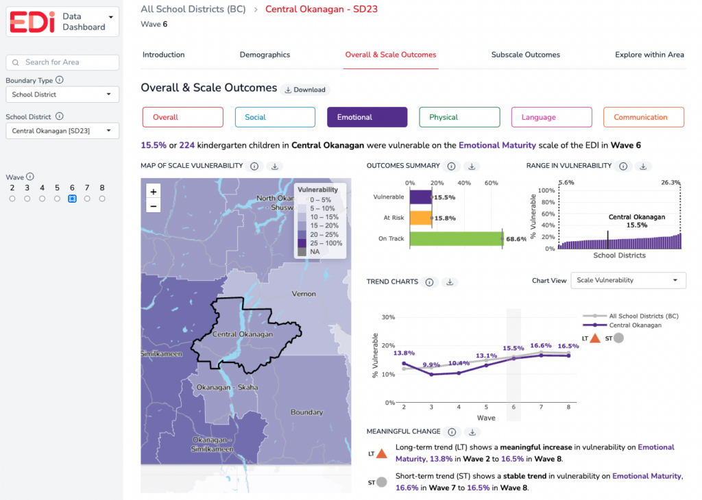
Map of vulnerability – Scale view– All maps on the EDI Data Dashboard display rates of vulnerability. In this module, the map indicates rates of vulnerability for the scale and boundary type selected. The darker the colour on the map, the higher the vulnerability rate. The zoom feature is available on the map to expand or narrow down a view. Hover over an area of interest to see the scale vulnerability rate for that area or click the location to bring up the scale-level outcome data for that location.
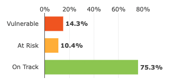
Outcomes summary bar chart – Scale view – This chart shows the percentage of children vulnerable (the colour shown is based on the selected scale), at risk (yellow), or on track (green) on the specific area of development the scale is measuring. See the sample chart below. The vertical comparison line in these bar charts represents an average for all areas within the selected boundary type. For example, when viewing the scale-level outcome for a school district, the average line represents All School Districts (BC Average) within the selected wave.
Range in vulnerability chart – Scale view – The range in vulnerability (scale-level) chart shows the distribution from lowest scale-level vulnerability rate to highest scale-level vulnerability rate for the selected boundary type for that scale. See sample chart below. Each bar represents the scale-level vulnerability rate for a specific area within the boundary type. The black bar, which appears when a specific area is selected, indicates the scale-level vulnerability rate for that selected area.
This chart provides helpful context for how the boundary type selected compares to other similar boundaries in terms of vulnerability rates on the scale selected. For example, if viewing neighbourhood data, consider whether the neighbourhood is on the lower or higher end of the range, or in the middle. It can be helpful to view data across waves to note if the neighbourhood’s position has changed over time or if it has remained in a similar position in comparison to other neighbourhoods in the province on the scale selected.
Trend Charts – Scale view – Collecting EDI data over multiple years allows for an improved understanding of trends in children’s development. Explore more about EDI scale-level trends over time with the following “Chart Views”:
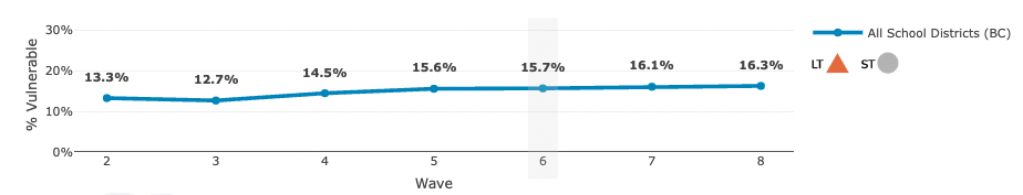
- Scale vulnerability chart – Shows the scale-level vulnerability rates for the selected area from Wave 2* to the current wave. A comparison line is shown in grey for the related ‘parent’ boundary/region. For example, when viewing a specific school district’s data, the grey line represents All School Districts (BC) — the province overall. See sample chart below.
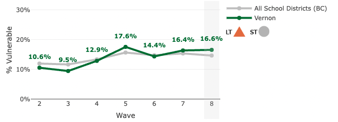
The symbols to the right of the chart indicate an area’s meaningful change in the long-term (LT) and short-term (ST). A summary of the long-term and short-term trends for the selected area are explained in the Meaningful Change section just below the trend charts:
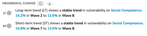
RELATED: See more information on meaningful change.
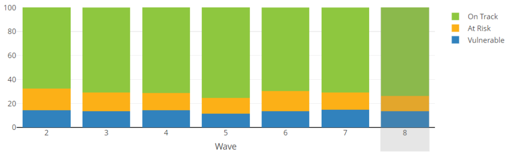
- Outcomes chart – Scale view – shows the percentage of children vulnerable, at risk and on track in their overall development (across all five scales of the EDI) for the selected boundary type from Wave 2* to the current wave. Hover over each colour on the bar graph to see the percentage of children in each overall outcome category.
NOTES:
*Due to changes in the EDI questionnaire after Wave 1 data collection, Wave 2 is HELP’s baseline and Wave 1 data are not publicly reported.
Trends are not available (N/A) if there are no data (i.e., the district did not participate) or data are suppressed. See more information on suppression.
Module: Subscales
This module highlights the subscale outcome data for the scale and boundary type selected.
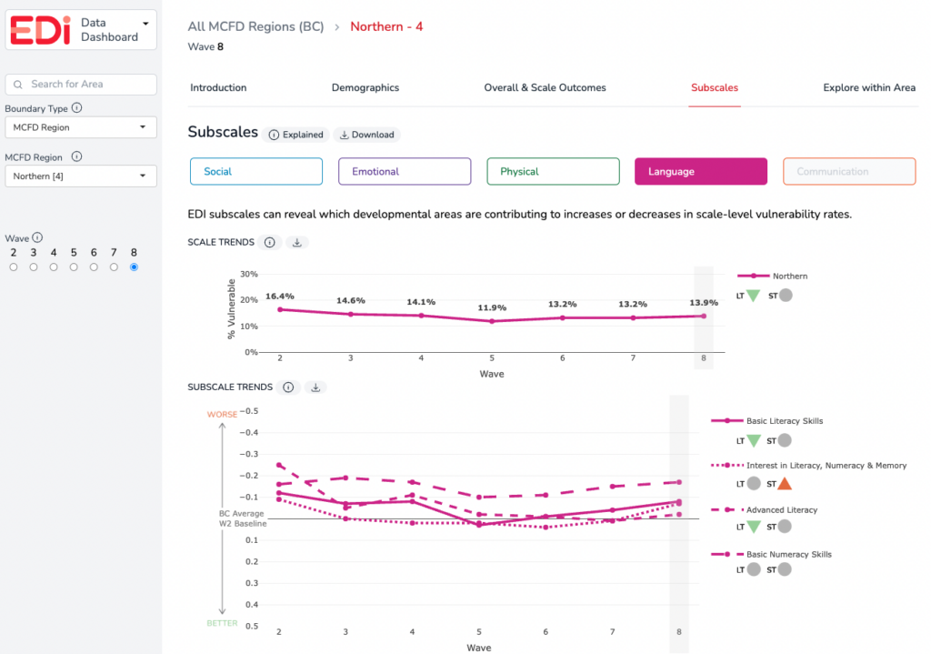
Each EDI scale is made up of a set of subscales (with the exception of the Communication Skills and General Knowledge Scale). There are 15 EDI subscales in total and each subscale measures a specific area of development contained within the larger scale. While data for the EDI scales allow us to assess trends and patterns in children’s vulnerability rates, subscale data allow us to refine our understanding of these population-level outcomes by providing information on the specific areas of development that are contributing to scale-level vulnerability.
In this module, viewers can select each of the five EDI scales to review the scale and subscale data for the area.
- Scale Trends (% vulnerable) – The top line chart in this module is the scale-level trend line that shows the percentage of children vulnerable on the EDI scale selected. For each EDI scale, a child is designated as vulnerable if their score falls below the 10th percentile cut-off in the area of development measured by the scale.
- Subscale Trends (standardized scores) – In contrast to the EDI scales, subscale data are reported as standardized versions of the raw scores. Subscale scores are benchmarked to the results of the Wave 2 provincial data collection (2004–2007), which is the earliest wave that HELP reports on. By using this benchmark as a baseline, the average provincial score for all subscales is set to zero for Wave 2. This allows us to both track trends over time in the subscale scores, and directly compare subscales with each other.
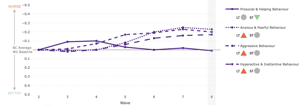
How to read the subscale trend graphs:
- A downward trend line indicates that children are doing better than before, and that the subscale is contributing to a decrease in the vulnerability rate.
- An upward trend line indicates that children are doing worse than before, and that the subscale is contributing to an increase in the vulnerability rate.
The symbols to the right of the chart indicate an area’s meaningful change in the long-term (LT) and short-term (ST).
RELATED: See more information on meaningful change.
Module: Explore within Area
This module highlights the data of sub-regions “within” a boundary type selected. For example, when viewing a specific school district’s data, the “Explore within Area” module will display data of the neighbourhoods within the school district.
By selecting from overall or each of the five EDI scales, vulnerability and outcome data can be viewed for sub-regions in an area.
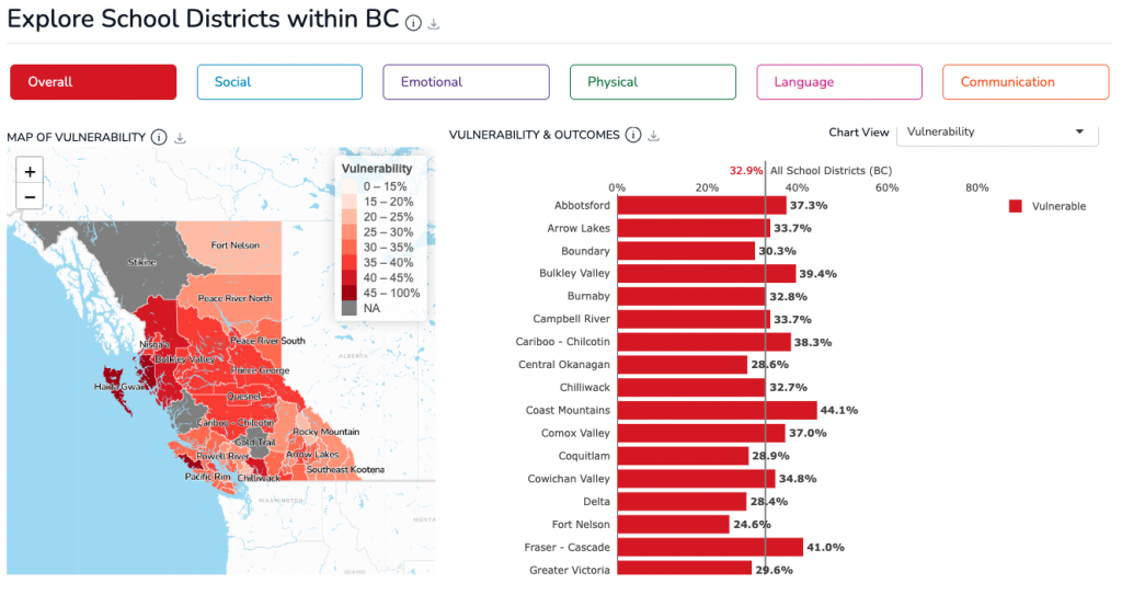
The vertical grey line represents the average for all areas within the selected boundary type. Please note, for all sub-regions of the Health boundary type (SDA, LSA, CHSA) the comparison line represents the average for the corresponding Health Authority that the specific area belongs to. Similarly, all sub-regions of the MCFD boundary type (SDA, LSA), the comparison line represents the average for the corresponding MCFD Region that the specific area belongs to.
NOTE: There are no data available for areas with a single sub-region or areas where there are no further sub-regions.
MAPS & CHARTS IN THIS MODULE
Map of overall & scale-level vulnerability – All maps on the EDI Data Dashboard display the rates of vulnerability. In this module, the map is showing the sub-regions within the boundary type selected and indicating rates of vulnerability for overall vulnerability or the scale selected. The darker the colour on the map, the higher the vulnerability rate. Double-clicking an area on the map will refresh the dashboard data and jump to the Overall & Scale Outcomes module showing data for the selected area.
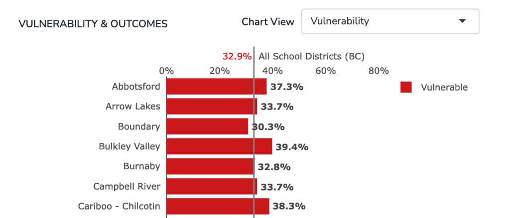
Vulnerability & Outcomes charts – The bar charts represent sub-regions within a selected boundary type. For example, if viewing a specific health authority such as Fraser Health, the regional boundaries within Fraser Health will be shown. The following “Chart Views” available in this module:
- Vulnerability – These charts show the overall or scale-level vulnerability rates for sub-regions within the selected area for the selected wave (by default, “Overall” is selected). The vertical grey line represents the average for all areas within the selected boundary type. For example, when viewing the overall vulnerability rates for neighbourhoods within a school district, the average line represents All School Districts (BC Average) within the selected wave.
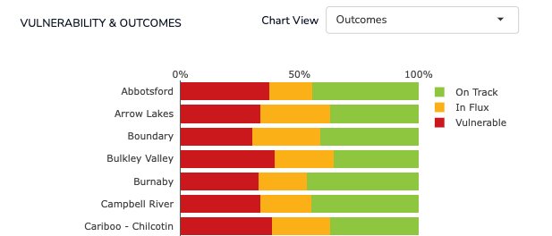
- Outcomes – These charts show the overall and scale-level outcomes for kindergarten children in a sub-region within a selected area for a selected wave. If “Overall” is chosen, the bar charts show the percentage and number of children who are vulnerable overall (red) in flux (yellow), and on track (green) for a sub-region within a selected area for a selected wave. If one of the five scales are chosen, the bar charts show the percentage and number of children vulnerable (colour depends on selected scale), at risk (yellow), or on track (green) on the specific area of development the scale selected is measuring. By hovering over each colour on the bar graph in the sample chart below, percentages and numbers of children in each outcome category will be displayed.
Feedback & Technical Issues
The EDI Data Dashboard is a new HELP reporting approach. We want to hear about your experience using the dashboard. Please click below to provide feedback, or report any technical issues that you encounter with the performance or functionality about the dashboard.
Provide Feedback Report Technical Issues